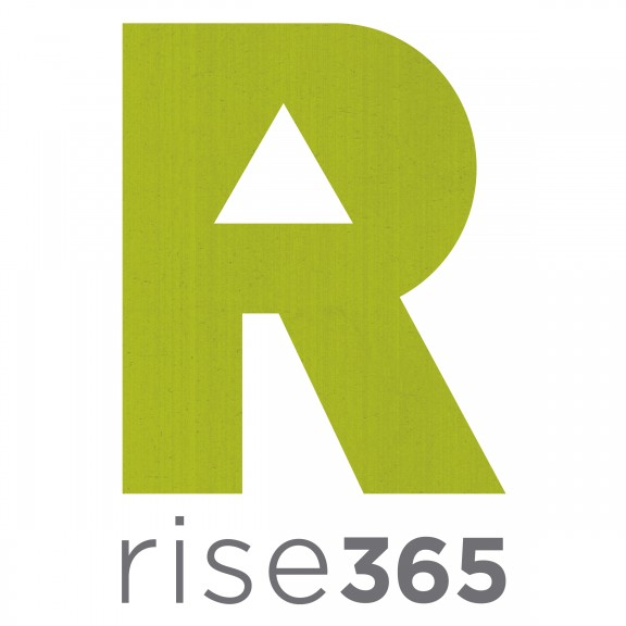
You may have noticed our site is looking a little different these days. Not only did we alter the background color to bring about a clean, simple feel, but we also had a logo designed!
Josh Mokma was our designer and he did a fabulous job! He not only designed the logo, he also helped us think through a bit of branding. These are things we have wanted to do for a while, so the whole experience was extremely fun and fulfilling!

The new rise365 logo!
Here’s a little bit of how we got to this final version with Josh:
1. The “R” – The strong “R” symbolizes strength and boldness which we resonated with
2. The arrow – The arrow in the center of the “R” pointing up symbolizes upward continued momentum throughout life
3. The color – This particular green struck us as representing energy, growth, and rejuvenation
4. The texture – Josh added some texture for us giving the logo more depth and character
5. The layout – This concept was simple yet bold, a little feminine and yet masculine which really encompasses us both
Claudia and I had a lot of fun working together on this project. It was exciting to see which of the different prototypes each of us were drawn to and why. It was also great to hear Josh’s ideas and expertise on things like branding and how specific color combinations and shapes would evoke the idea and message we wanted to convey.
We cannot say enough about how great Josh was to work with! He was able to grasp our ideas and vision for the site and put them into physical form. And, not only is he an exceptional designer, but he is quick to respond and very clear and straight forward. He knows his stuff and does it very, very well.
Like the logo? Leave us a comment and let us know!
p.s. Be sure to stop back this Thursday. We’ll be releasing our first book, Compass: A Life Direction System for Couples!


Love the new logo! You did a great job getting something that says who you are I think. Love it!
Hey thanks, Donna!
Wow guys it’s beautiful and really expresses your vision perfectly.
Thanks, Ann! Josh did an amazing job helping us clarify what our vision could look like on paper and then being able to create it.
That green is fantastic. 🙂 I’m so excited to see your dream and business continue to expand!
Thanks, Alana! By the way, http://alanamokma.com/ is looking fantastic! It seems like you made a few changes since it launched. Is that right?
I also like your logo. I like the reasoning behind each aspect of the design. It really seems to fit you guys. Great job to everyone involved!
Thanks, Jody. Josh was great to work with!
Love it, need to get back on your site it has been a while : (
Thanks, Mike! We had a lot of fun with the process.